

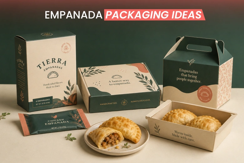
Empanadas, who doesn’t love them? These baked goods are the ultimate comfort food. They are
 Skip to content
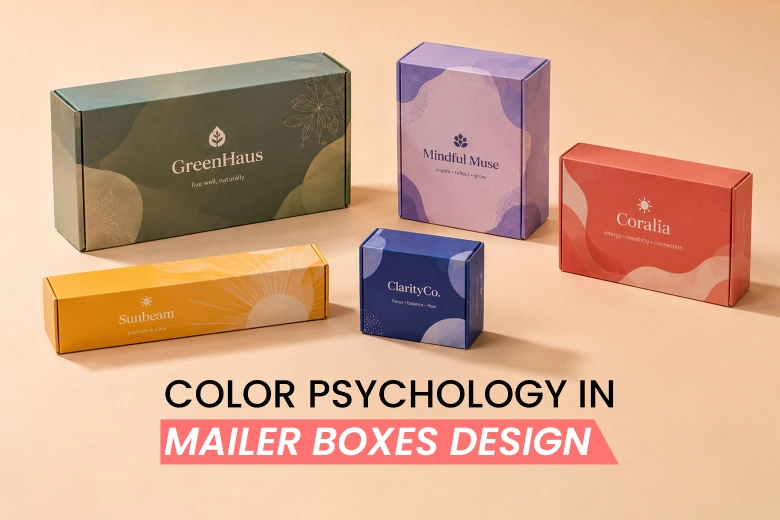
 In the world of e-commerce, your product packaging influences customers’ perceptions. While structural integrity is key, the color of your mailer box is what sparks the emotional connection. It is the one that turns a one-time buyer into a loyal advocate.
Whether it’s the rustic charm of kraft or a branded navy, the right color defines the entire unboxing experience your customers will get.
So, let’s explore the power of psychology in mailer boxes design and how to apply it to match your branding vibe.
Before you even think about colors, you have to choose the foundation of your box. Most mailer boxes come in two main base material colors:
Colors aren’t just decorative; they are psychological triggers. In fact, according to packaging color psychology, colors can affect a customer’s perception of your product and brand.
Thus, understanding what each color reflects can help you match your mailer boxes design to your brand persona.
Let’s break it down.

A blue-colored mailer box conveys trustworthiness, calmness, and reliability. When you choose dark blues, your brand will look professional. Meanwhile, lighter blues are ideal for a softer and more creative vibe.
Ideal products: High-end electronics, healthcare products, and financial tools.

Black mailer boxes reflect luxury, elegance, and sophistication. Polish your box with metallic (gold/silver) foil stamping or matte finishes to enhance the “expensive” feel.
Ideal products: Luxury beverages, high-end watches, or premium fashion.

Choosing a green mailer box means you are presenting a brand persona of nature, health, and peacefulness. Go with light/sage green to signal organic and nutritious items. Alternatively, dark green implies wealth, sustainability, and luxury.
Ideal products: Eco-friendly skincare, CBD products, or organic food.

How about red mailer boxes?
Red color delivers excitement, passion, and urgency. Applying this color will help you grab more attention. However, you should apply it strategically, as it can look too aggressive.
Ideal products: Special promotions, limited-time offers, or products designed to stand out immediately. Red can also stimulate appetite, which is why it is common in food packaging.

A purple mailer box represents luxury, royalty, and creativity. This color also evokes a sense of uniqueness and mystery. Purple is the best color to attract female and youth demographics.
Ideal products: Cosmetic products, high-end, or specialty items.

Navy blue mailer boxes help you communicate trust, sophistication, and authority. This color conveys premium quality, security, or a reliable, “old money” aesthetic. Plus, it acts as a more modern alternative to black.
Ideal products: Corporate gifts or high-end men’s grooming products.

If you want to present energy, optimism, and affordability, choose yellow mailer boxes. The yellow color can really boost your product visibility. Whether on display or e-commerce shipping, this color makes everyone notice your box.
Ideal products: Food & beverages, children’s products, or cleaning items.
Different types of materials result in different color appearances. Accordingly, the material you choose impacts both structural integrity and print quality.
Mailer boxes are mainly made from corrugated cardboard (E-flute or B-flute) for strength and sustainability, featuring Kraft brown, mottled white, or black finishes.
So, how to choose the right color based on your packaging material?

Standard brown kraft corrugated is a fibrous material made from unbleached virgin pulp.
Suitable colors: Dark colors like black or navy blue work best with this material. Do note that lighter colors can appear muted or absorbed by the natural brown tone.

Often called “Oyster White,” this material is an uncoated white surface that still shows slight, natural brown kraft undertones.
Suitable colors: Lighter, more vibrant colors will appear more “live” on this material.

Black kraft paper features a black top layer and is often used for luxury branding.
Suitable colors: Use white ink to create a premium, high-contrast look. You can also polish it with gold foil stamping to make your box look more exclusive.

Unbleached, uncoated kraft is the natural, eco-friendly state of virgin paper pulp.
Suitable colors: This material is limited to dark, rustic colors due to its high-textured natural look.
Once you have selected your palette, how you apply it to mailer boxes matters as much as the colors themselves.
Here’s what you should note.
Some e-commerce brands keep the outside plain (Kraft) for shipping security. Then, they apply a vibrant color or pattern on the inside to surprise customers during unboxing.
Sometimes less is more. Minimalist designs with just a black or white logo on your mailer box can represent an elegant branding vibe.
Using large blocks of bold pattern can make your package instantly recognizable from a distance.
The color scheme you choose should reflect your brand identity, not just for aesthetics.
When it comes to custom packaging boxes, the printing technique defines how they will look. And the same goes for mailer boxes.
To ensure your design matches the physical box, you need to understand the technical side of print production.
Go with CMYK (Cyan, Magenta, Yellow, Black) if you need multi-color images. On the other hand, choose PMS (Pantone Matching System) for absolute color consistency across different print runs.
For simple, high-volume designs, the offset printing technique delivers the best result. But if you need multi-colored designs with lower minimums, go with a digital technique.
Investing in color for your mailer box design isn’t just an expense. It is a strategic marketing move.
Here’s why color matters in your mailer box design.
In a sea of brown shipping boxes, a splash of color on your box helps your product stand out.
Using specific, branded colors on your boxes makes your brand immediately recognizable. As a result, you can turn every mailer box into a branded “billboard.”
Colored mailer boxes create anticipation and excitement. This means that you are shifting a basic delivery into a memorable event. And this memorable event is essential for e-commerce and social media sharing.
The choice of color can tell customers about your product types. For example, green often suggests organic products, while white conveys clean, minimalist, high-quality items.
Moreover, the color of your box also helps customers understand the product’s quality. Dark or muted tones like black often represent luxury. Meanwhile, bright, bold colors like yellow or red can suggest playful or affordable products.
As we mentioned about color psychology, colors can evoke specific emotions and perceptions. For example, blue can make customers perceive your brand as reliable. Meanwhile, green signals that your business values eco-friendliness and sustainability.
Indeed, the color of your mailer box is what sparks the emotional connection. It is the one that turns a one-time buyer into a loyal advocate. Color matters in a mailer box design as product differentiation, brand identity & recognition, unboxing experience, product signaling, positioning, and psychological impact.
So, which color would you like to choose for your mailer boxes?
A blue-colored mailer box conveys rustworthiness, calmness, and reliability. It is ideal for high-tech electronics, healthcare services, and financial tools.
Black mailer boxes reflect luxury, elegance, and sophistication. They are ideal for packaging luxury beverages, high-end watches, or premium fashion.
Purple is the best color to convey luxury, premium quality, creativity, or mystique. This color works well for shipping cosmetic products in a mailer box, as it attracts female and youth demographics.
Color matters in a mailer box design as product differentiation, brand identity & recognition, unboxing experience, product signaling, positioning, and psychological impact.

Empanadas, who doesn’t love them? These baked goods are the ultimate comfort food. They are
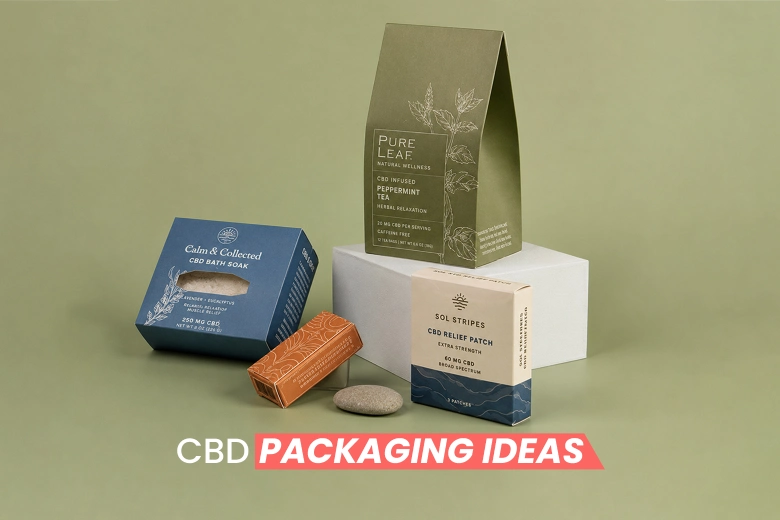
The CBD market is booming, but a crowded retail shelf makes it hard to stand

The “green” experiment phase is over. In 2026, sustainable packaging has turned from a marketing